

Analytics engineers face tough choices when picking the right business intelligence tools for their data workflows. With dozens of platforms available, each offering different strengths in visualization, modeling, and integration capabilities, the decision can make or break a team’s productivity.
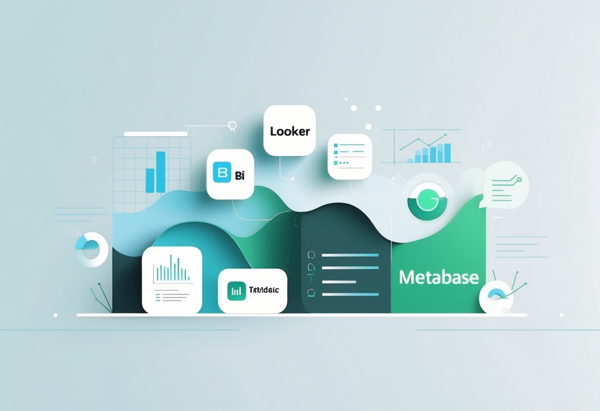
The five BI tools that stand out for analytics engineers are Looker for semantic modeling, Power BI for Microsoft integration, Tableau for advanced visualization, Metabase for open-source simplicity, and Sigma for spreadsheet-native analytics. Each platform serves different needs, from complex data modeling to quick dashboard creation.
Modern BI tools have evolved beyond basic charting to include AI-powered features, natural language querying, and embedded analytics capabilities. Understanding how these platforms compare across factors like cost, learning curve, and ecosystem integration helps teams choose the right tool for their specific use cases and technical requirements.
Key Takeaways
- Each BI tool excels in different areas, with Looker focusing on data modeling, Power BI on Microsoft integration, and Tableau on visualization flexibility
- Selection criteria should include technical requirements, team skills, budget constraints, and existing data infrastructure compatibility
- Modern BI platforms increasingly offer AI features, embedded analytics, and cloud-native capabilities that transform how teams interact with data
Overview of Business Intelligence Tools

Business intelligence transforms raw data into actionable insights through specialized software platforms. These tools serve as the foundation for modern analytics engineering, enabling organizations to connect multiple data sources and create meaningful visualizations.
Defining Business Intelligence
Business intelligence refers to the technology-driven process of analyzing business data to help organizations make informed decisions. BI encompasses data collection, storage, analysis, and presentation through interactive dashboards and reports.
Modern BI systems pull information from various sources including databases, spreadsheets, cloud applications, and real-time data streams. They process this information to identify trends, patterns, and key performance indicators.
The primary goal of business intelligence is to provide stakeholders with timely, accurate insights. These insights help teams understand past performance, monitor current operations, and predict future outcomes.
Business intelligence tools gather data and track performance across different business functions. They eliminate manual reporting processes and reduce the time needed to generate insights.
Role of BI Tools in Analytics Engineering
Analytics engineers rely on BI tools to bridge the gap between raw data and business users. These platforms handle the final layer of the data pipeline, transforming clean datasets into user-friendly interfaces.
BI tools integrate seamlessly with modern data stacks including data warehouses, transformation tools, and orchestration platforms. They consume prepared datasets and apply additional business logic as needed.
Key responsibilities of BI tools in analytics workflows:
- Data visualization: Convert numerical data into charts, graphs, and interactive dashboards
- Self-service analytics: Enable business users to explore data without technical assistance
- Report automation: Generate and distribute regular reports to stakeholders
- Data governance: Maintain consistent definitions and access controls across the organization
Analytics engineers configure these tools to ensure data accuracy and optimize query performance. They also establish security protocols and user permissions to protect sensitive information.
Key Features of Modern BI Platforms
Contemporary BI tools offer advanced capabilities that support complex analytical workflows. These features enable organizations to scale their data operations and democratize access to insights.
Essential BI platform capabilities:
| Feature | Description |
|---|---|
| Data Connectivity | Native integrations with databases, cloud services, and APIs |
| Semantic Layer | Centralized business logic and metric definitions |
| Interactive Dashboards | Dynamic visualizations with filtering and drill-down capabilities |
| Mobile Access | Responsive design for viewing reports on any device |
Modern BI tools connect to diverse data sources and create compelling visualizations for end users. They support both technical and non-technical users through intuitive interfaces.
Advanced platforms include artificial intelligence features such as automated insights, natural language querying, and predictive analytics. These capabilities help users discover patterns they might otherwise miss.
Version control and collaboration features allow teams to manage dashboard development like software projects. Git integration enables proper testing and deployment workflows for analytics assets.
Comparison Criteria for Selecting BI Tools
Analytics engineers must evaluate BI tools across four critical dimensions: how well they connect to data sources, their user experience complexity, collaboration features, and security frameworks. These factors determine whether a tool will integrate smoothly into existing workflows and meet organizational requirements.
Data Connectivity and Integration
Database compatibility forms the foundation of any BI tool evaluation. Modern analytics platforms must connect seamlessly to cloud data warehouses like Snowflake, BigQuery, and Redshift, as well as traditional databases such as PostgreSQL and MySQL.
BI tools require proper integration with data platforms to function effectively within existing architectures. Tools like Looker and Sigma excel at leveraging cloud data warehouse performance directly.
API connectivity enables real-time data access from SaaS applications. The best tools offer pre-built connectors for popular platforms like Salesforce, HubSpot, and Google Analytics without requiring custom development work.
ETL capabilities vary significantly between platforms. Some tools include built-in data transformation features, while others depend entirely on external data pipelines. This affects how datasets flow from raw sources into analytical models.
Performance optimization depends heavily on how tools query underlying databases. Push-down query engines that execute SQL directly on the database typically outperform tools that pull large datasets into memory for processing.
Ease of Use and Learning Curve
Interface design directly impacts user adoption rates across different skill levels. Drag-and-drop interfaces appeal to business users, while SQL-based tools attract technical analysts who prefer direct database access.
Learning resources include documentation quality, community forums, and training materials. Established platforms like Tableau and Power BI offer extensive learning ecosystems that reduce onboarding time for new users.
Technical requirements vary from simple web browsers to complex desktop installations. Cloud-native tools eliminate software deployment challenges but may require different security considerations than on-premise solutions.
User personas should guide tool selection decisions. Analytics novices benefit from low-cost alternatives like Power BI Pro, while advanced users might prefer tools with sophisticated modeling capabilities.
Customization options allow organizations to tailor interfaces to specific workflows. Some platforms offer extensive white-labeling features, while others maintain fixed user experiences across all deployments.
Collaboration and Sharing Capabilities
Dashboard sharing mechanisms range from simple URL links to sophisticated embedding options. Modern business intelligence platforms must support both internal sharing and external client access with appropriate permission controls.
Version control becomes critical when multiple analysts work on the same reports. Tools with built-in versioning prevent conflicts and enable rollback capabilities when changes break existing functionality.
Comment systems facilitate communication around specific data points or visualizations. The most effective platforms integrate discussion threads directly into dashboards rather than requiring separate communication channels.
Export functionality supports various business needs from executive presentations to regulatory reporting. Standard formats include PDF, PowerPoint, Excel, and programmatic API access for automated distribution workflows.
Mobile optimization ensures stakeholders can access critical metrics regardless of device type. Native mobile apps typically provide better performance than responsive web interfaces for complex dashboard interactions.
Governance, Security, and Compliance
Access controls must align with organizational hierarchies and data sensitivity levels. Row-level security ensures users only see data relevant to their roles, while column-level permissions protect sensitive information like personal identifiers.
Audit trails track user actions for compliance and troubleshooting purposes. Comprehensive logging includes dashboard views, data exports, and configuration changes with timestamp and user attribution details.
Data lineage capabilities help analysts understand how datasets flow through transformation pipelines. This visibility becomes essential for impact analysis when upstream data sources change or encounter quality issues.
Encryption standards protect data both in transit and at rest. Enterprise-grade tools implement industry-standard protocols like TLS 1.3 for network communication and AES-256 for stored information.
Compliance certifications such as SOC 2, GDPR, and HIPAA indicate vendor commitment to regulatory requirements. Organizations in regulated industries must verify that chosen platforms meet specific legal obligations for data handling.
Tableau: Powerful Data Visualization

Tableau stands out as a highly visual BI tool that excels in creating interactive and dynamic dashboards with its intuitive drag-and-drop interface. The platform offers three main deployment options and delivers advanced visualization capabilities that make complex data accessible to both technical and non-technical users.
Core Features of Tableau
Tableau’s drag-and-drop interface allows users to create visualizations without coding knowledge. Users can connect to multiple data sources simultaneously and blend data from different systems in real-time.
The platform supports live connections and data extracts. Live connections query data sources directly, while extracts create local copies for faster performance.
Smart recommendations suggest chart types based on selected data fields. The system automatically detects data types and recommends appropriate visualizations.
Advanced features include:
- Calculated fields for custom metrics
- Parameters for interactive filtering
- Sets for grouping data points
- Table calculations for complex computations
Tableau handles large datasets efficiently through data engine optimization. The platform can process millions of rows while maintaining interactive performance.
Tableau Desktop, Public, and Server
Tableau Desktop serves as the primary authoring tool for creating dashboards and reports. It connects to databases, files, and cloud services with over 100 native connectors.
Tableau Public offers free visualization creation with public sharing requirements. All workbooks published to Tableau Public become visible to anyone online, making it suitable for journalists, bloggers, and researchers sharing non-sensitive data.
Tableau Server enables enterprise deployment with security controls and collaboration features. Organizations can publish dashboards internally, manage user permissions, and schedule data refreshes.
Key differences between versions:
| Feature | Desktop | Public | Server |
|---|---|---|---|
| Cost | Paid license | Free | Enterprise pricing |
| Data privacy | Private | Public only | Private |
| Collaboration | Limited | Public sharing | Full enterprise |
Strengths and Limitations
Tableau excels in visualization variety and interactivity. The platform offers extensive chart types, including maps and dynamic visuals that engage users effectively.
Key strengths include:
- Intuitive visual interface requiring minimal training
- Extensive customization options for advanced users
- Strong community support and learning resources
- Excellent performance with properly optimized data
Notable limitations affect adoption:
- Higher pricing that can escalate with more features
- Performance issues with extremely large datasets
- Limited statistical analysis capabilities compared to specialized tools
- Steep learning curve for advanced calculated fields and complex dashboards
The platform requires separate licensing for each deployment option. Organizations often need multiple licenses as teams grow, increasing total cost of ownership.
Power BI: Integration with Microsoft Ecosystem

Power BI stands out for its seamless connectivity with Microsoft’s suite of business applications and cloud services. The platform offers desktop and web-based tools that work together to create a complete analytics workflow from data preparation to report sharing.
Key Functionalities of Power BI
Power BI provides three main components that work together in the Microsoft environment. Power BI continues its reign at the top with a powerful combination of affordability, deep integration with Microsoft 365 and Azure.
Power BI Desktop serves as the primary authoring tool for creating reports and dashboards. Users can connect to over 100 data sources including Excel, SQL Server, SharePoint, and Azure services.
Power BI Service acts as the cloud-based platform for publishing and sharing content. Teams can collaborate on reports and set up automatic data refresh schedules.
Power BI Mobile allows users to view dashboards and reports on phones and tablets. The mobile app works with iOS, Android, and Windows devices.
The platform connects directly with Microsoft tools that many organizations already use:
- Excel: Import existing spreadsheets and pivot tables
- SharePoint: Embed reports in team sites
- Teams: Share dashboards in team channels
- Azure: Access cloud databases and analytics services
- Dynamics 365: Pull in customer and sales data
Power BI Desktop and Service
Power BI Desktop runs on Windows computers and handles the heavy work of data modeling and report creation. Users build visualizations by dragging fields onto the canvas and choosing from over 30 chart types.
The desktop tool includes a query editor for cleaning and transforming data. Users can merge tables, remove duplicates, and create calculated columns using DAX formulas.
Reports created in Power BI Desktop get published to the Power BI Service in the cloud. The service provides a web interface where users can view reports in any browser without installing software.
Key differences between Desktop and Service:
| Feature | Power BI Desktop | Power BI Service |
|---|---|---|
| Data modeling | Full capabilities | Limited editing |
| Report creation | Complete authoring | Basic modifications |
| Data refresh | Manual only | Scheduled automatic |
| Sharing | Not available | Full collaboration |
The service handles data refresh schedules and manages security permissions. Administrators can control who sees which reports and dashboards across the organization.
Collaboration and Deployment Options
Power BI Service organizes content into workspaces where teams can collaborate on projects. Each workspace contains related reports, dashboards, and datasets that team members can access based on their permissions.
Workspace roles include:
- Admin: Full control over workspace settings
- Member: Can publish and edit content
- Contributor: Can create content but not publish
- Viewer: Read-only access to reports
Integrating Power BI with other Microsoft tools enhances data-driven decision-making through seamless workflow connections. Users can embed Power BI reports directly in SharePoint pages or Teams channels for easy access.
The platform offers several deployment methods. Organizations can share individual reports, create app packages with multiple reports, or embed visualizations in custom applications using Power BI Embedded.
Row-level security controls which data users see based on their login credentials. This feature works with Active Directory to automatically filter reports based on the viewer’s permissions in other Microsoft systems.
Looker: Data Modeling with LookML

Looker is built for real-time data exploration and advanced modeling using LookML setting it apart from other BI tools through its unique approach to data definitions and business logic. LookML creates a modeling layer that transforms raw data into meaningful business metrics that teams can use across dashboards and reports.
Understanding LookML and Modeling Layer
LookML is Looker’s proprietary modeling language that defines data relationships and business metrics directly on top of raw data. This approach eliminates the need to pre-process data before analysis.
The modeling layer acts as a bridge between databases and end users. Data engineers write LookML code to define dimensions, measures, and relationships once. These definitions then become available to all users across the organization.
Key LookML components include:
- Dimensions: Fields that group and filter data
- Measures: Calculations and aggregations
- Explores: Data structures that users can query
- Views: SQL tables or derived tables
LookML uses a Git-based workflow for version control. This means data teams can track changes, collaborate on models, and deploy updates safely. The language follows a structured syntax that defines how data connects and calculates.
Building Reports and Dashboards in Looker
Looker’s interface allows users to create reports and dashboards using the pre-defined LookML models. Users drag and drop dimensions and measures without writing SQL queries.
The Explore interface serves as the main tool for building reports. Users select fields from the modeling layer to create visualizations. Looker automatically generates the underlying SQL based on the LookML definitions.
Dashboard creation features:
- Filters: Dynamic controls that update all dashboard elements
- Drill-down capabilities: Users can click into data for deeper analysis
- Scheduled delivery: Automated report distribution via email or Slack
- Mobile optimization: Dashboards adapt to different screen sizes
Metrics defined in a Looker model can be consumed everywhere, including across popular BI tools such as Looker Studio, Power BI, and Tableau. This integration capability extends Looker’s reach beyond its native interface.
Unique Advantages and Potential Drawbacks
Looker’s modeling approach offers significant advantages for organizations with complex data needs. The centralized definitions ensure consistent metrics across all reports and dashboards.
Primary advantages:
- Single source of truth: All users access the same metric definitions
- Developer-friendly: Git workflow appeals to technical teams
- Scalability: Models handle large datasets efficiently
- Data governance: Centralized control over business logic
Potential limitations:
- Learning curve: LookML requires technical expertise to implement
- Setup complexity: Initial modeling takes significant time investment
- Cost: Enterprise pricing may be high for smaller organizations
- Dependency: Changes to models require developer involvement
The platform works best for organizations with dedicated data teams who can maintain the LookML models. Companies without technical resources may find the initial setup challenging compared to more user-friendly BI tools.
Metabase: Simplicity and Open Source BI
Metabase is the easy, open-source way for everyone to ask questions and learn from data, making it one of the most accessible business intelligence tools available. It combines powerful database connectivity with an intuitive interface that enables both technical and non-technical users to create visualizations and dashboards without extensive training.
Overview of Metabase Features
Metabase offers a comprehensive set of features designed for ease of use. The platform provides a Question Mode that allows users to build queries through a visual interface without writing SQL code.
Users can select fields from dropdown menus and generate charts with just a few clicks. For more advanced users, Metabase includes a full SQL query editor that connects to over 20 different database types.
The platform’s visualization options cover essential chart types including bar charts, line graphs, pie charts, and tables. While not as extensive as Tableau’s offerings, these options handle most standard business reporting needs effectively.
Dashboard creation uses a simple drag-and-drop interface. Users can arrange multiple visualizations on a single dashboard and apply filters that work across all connected charts.
Metabase also includes Models functionality, which allows users to create reusable data sources with custom metadata and column descriptions. This feature helps prepare clean datasets for business users who need consistent reporting.
Use Cases in Modern Data Stacks
Metabase works particularly well for organizations implementing self-service analytics. Teams can connect it directly to their data warehouse or operational databases to create reports without involving IT departments.
Startup and mid-size companies often choose Metabase as their primary BI tool because it requires no licensing fees. The open-source nature means teams can deploy it on their own infrastructure and scale as needed.
The tool excels at operational reporting where users need quick answers to business questions. Marketing teams can track campaign performance, sales teams can monitor pipeline metrics, and executives can view key performance indicators.
Metabase is ideal for quick, intuitive data exploration that lets people in your company click around in interactive dashboard and visualizations to learn from data. This makes it valuable for organizations wanting to democratize data access across departments.
However, Metabase’s simplicity can become a limitation for complex analytics needs. Teams handling large datasets or requiring advanced statistical analysis may find the platform insufficient for their requirements.
Customization and Extensibility
Metabase provides several customization options despite its focus on simplicity. Users can apply conditional formatting to tables and charts, highlighting specific values based on business rules.
The platform supports Actions, which are custom SQL queries that can be turned into buttons for database interactions. Teams can create “Refresh” buttons to update dashboard data or “Approve” buttons that modify records directly.
Collections help organize dashboards, reports, and models into logical folders. This organizational structure becomes crucial as teams create more content and need to maintain governance over their analytics assets.
For visual customization, the free version offers limited options. However, Metabase Cloud provides advanced dashboard styling and branding capabilities for organizations needing more polished presentations.
API access allows developers to integrate Metabase with other tools in their data stack. Teams can embed dashboards in external applications or automate report generation through programmatic interfaces.
The Metabase Copilot plugin provides AI assistance for query writing and troubleshooting, helping teams without dedicated data engineers build more sophisticated reports and resolve common database connectivity issues.
Sigma: Spreadsheet-Native Analytics

Sigma Computing brings a cloud-native analytics platform that transforms how analytics engineers interact with data through its familiar spreadsheet interface. The platform eliminates the need for SQL expertise while maintaining enterprise-grade capabilities for live data analysis and visualization creation.
Core Capabilities of Sigma
Sigma’s spreadsheet-like interface makes data analytics accessible to users familiar with Excel while providing advanced BI functionalities. Analytics engineers can create complex calculations and statistical analyses without writing SQL code.
The platform supports drag-and-drop functionality for building visualizations and dashboards. Users can manipulate data models directly through the familiar spreadsheet layout. Sigma enables sophisticated analyses including cohort analysis, predictive analytics, and custom calculations.
Key features include:
- No-code advanced analytics
- Interactive drill-downs and tooltips
- Customizable visualization options
- Real-time collaboration capabilities
The platform integrates effectively with data science tools for specialized analysis needs. Analytics engineers can perform complex data transformations using the intuitive interface without requiring extensive technical training.
Working with Datasets and Live Data
Sigma’s cloud-native architecture connects directly to cloud data warehouses including Snowflake, Google BigQuery, and Amazon Redshift. This approach ensures queries execute in high-performance environments with minimal latency.
The platform provides real-time query capabilities that keep users working with current data. Analytics engineers can interact directly with massive datasets stored in cloud warehouses without moving data.
Data handling benefits:
- Live connections to multiple data sources simultaneously
- Efficient data blending and integration
- In-memory processing for large datasets
- No data extraction requirements
Sigma handles substantial data volumes through optimization techniques that deliver quick responses. The platform’s architecture eliminates traditional performance bottlenecks associated with data movement and storage limitations.
Advantages for Analytics Engineers
Analytics engineers benefit from Sigma’s reduced learning curve compared to traditional BI tools. The spreadsheet interface requires no technical background while delivering comprehensive data exploration capabilities.
The platform enables faster deployment of analytics solutions. Engineers can build dashboards and reports more quickly using familiar spreadsheet functions and formulas.
Professional advantages:
- Reduced time-to-insight for data projects
- Lower training requirements for end users
- Scalable performance with enterprise datasets
- Flexible pricing based on platform access
Sigma excels in processing large and complex datasets efficiently, making it ideal for organizations with significant data processing requirements. Analytics engineers can focus on analysis rather than tool mastery, improving overall productivity and project outcomes.
Advanced Features in Modern BI Tools
Modern BI tools have evolved beyond basic reporting to include sophisticated capabilities that enable non-technical users to perform complex analytics. These features focus on democratizing data access through intuitive interfaces and consistent data definitions.
Self-Service Analytics
Self-service analytics allows business users to create reports and dashboards without technical support. Users can connect to data sources, build visualizations, and share insights independently.
Drag-and-drop interfaces make it simple to create charts and graphs. Users select fields from data tables and drop them into visualization areas. No coding skills are required.
Pre-built templates speed up dashboard creation. Users choose from ready-made layouts for common business scenarios like sales performance or customer analytics.
Automated data preparation handles routine tasks like cleaning and formatting. The system identifies data quality issues and suggests fixes. Users can accept recommendations with a single click.
Interactive filtering lets users explore data dynamically. They can slice information by date ranges, regions, or product categories. Changes update all charts instantly.
Popular tools like Power BI and Tableau excel at providing these self-service capabilities to business teams.
Semantic Layer and Metrics Consistency
A semantic layer creates a unified view of business data across different systems. It defines metrics once and applies them consistently throughout the organization.
Single source of truth eliminates conflicting numbers between departments. Finance and marketing teams see identical revenue figures because they pull from the same definitions.
Business-friendly naming replaces technical database terms with familiar language. “Customer_ID” becomes “Customer Number” and “Rev_Amt” becomes “Revenue Amount.”
Calculated fields store complex formulas centrally. Metrics like customer lifetime value or profit margins use consistent calculations across all reports.
Data governance controls who can access which information. The semantic layer enforces security rules and data permissions automatically.
Version control tracks changes to metric definitions over time. Teams can see when calculations changed and who made the updates.
This approach prevents the common problem where different teams create their own versions of the same metric.
Natural Language Query Capabilities
Natural language query allows users to ask questions in plain English instead of writing complex database queries. The system interprets requests and generates appropriate visualizations.
Conversational interface accepts questions like “show me sales by region last quarter” or “which products had the highest growth.” Users type or speak their requests naturally.
Smart suggestions help users refine their questions. The system recommends related metrics or different time periods based on the initial query.
Automatic chart selection chooses the best visualization type for each question. Time-series data becomes line charts while categorical comparisons become bar charts.
Follow-up questions enable deeper exploration. Users can ask “why did sales drop in March” after seeing a revenue chart.
Context awareness remembers previous questions in a session. Users can say “show me the same data for last year” without repeating the full request.
Modern BI platforms increasingly integrate these natural language capabilities to make data analysis more accessible to all business users.
Integrating BI Tools with the Data Ecosystem

Modern BI tools must connect seamlessly with cloud warehouses, work alongside ETL pipelines and data modeling frameworks, and support version-controlled workflows that treat analytics as code.
Connecting to Cloud Data Warehouses
Snowflake, BigQuery, and Redshift serve as the backbone for most analytics workflows. Power BI connects natively to these platforms through built-in connectors that handle authentication and query optimization automatically.
Tableau offers direct connections to major cloud warehouses but requires careful configuration for optimal performance. Large datasets can cause slow load times without proper indexing.
Looker excels at warehouse integration through its semantic modeling layer. It pushes computations down to the database level, reducing data movement and improving query speed.
Sigma Computing takes a unique approach by running entirely on cloud warehouses. Users work in spreadsheet-like interfaces while Sigma generates SQL that executes directly against Snowflake or BigQuery.
Metabase provides straightforward database connections with support for over 20 data sources. Its caching layer helps reduce warehouse costs by storing frequently accessed query results.
Collaboration with ETL and Data Modeling Tools
dbt integration represents a critical requirement for modern data teams. Tools like Holistics support Git-based workflows that align with dbt model development and testing processes.
Looker reads dbt model metadata to automatically generate explore definitions. This connection ensures that business logic stays consistent between transformation and visualization layers.
Fivetran and Airbyte handle data ingestion while BI tools consume the cleaned, transformed datasets. Power BI works well with Azure Data Factory for teams using Microsoft’s ecosystem.
Evidence.dev takes a developer-first approach by treating dashboards as code that lives alongside dbt models. This tight integration appeals to analytics engineers who prefer version control over GUI-based development.
Data lineage tracking becomes easier when BI tools integrate with orchestration platforms like Airflow or Prefect. Teams can trace data from source systems through transformations to final dashboards.
Version Control and As-Code BI
Git-based development allows analytics teams to apply software engineering practices to dashboard creation. Tools with version control capabilities enable code reviews, automated testing, and deployment pipelines.
Holistics stores dashboard definitions, metrics, and data models as code files in Git repositories. Teams can branch, merge, and deploy analytics assets using familiar developer workflows.
Evidence.dev builds entirely on this philosophy by generating dashboards from SQL files and markdown templates stored in version control. Changes go through pull request reviews before reaching production.
Rill Developer offers similar capabilities with its project-based approach. Datasets, metrics, and dashboards are defined in YAML files that teams can version and collaborate on through Git.
CI/CD pipelines can automatically test dashboard logic, validate data quality, and deploy changes across environments. This approach reduces manual errors and ensures consistent deployment processes across teams.
Emerging Trends and Alternative BI Platforms

The BI landscape continues to evolve with open-source solutions gaining enterprise adoption and specialized platforms focusing on specific use cases. Modern analytics engineers are exploring Git-based workflows and lightweight alternatives that integrate seamlessly with existing data stacks.
Open Source and Community-Driven BI
Open-source BI tools offer flexibility and cost savings for organizations with technical resources. Apache Superset leads this category with advanced visualization capabilities and extensive customization options.
Metabase provides a user-friendly interface that bridges technical and business users. It offers both cloud and self-hosted options. The platform excels at quick setup and basic analytics needs.
Grafana has expanded beyond monitoring into general BI use cases. It connects to multiple data sources and provides real-time dashboards. The tool works well for operational analytics.
Key benefits of open-source platforms include:
- No licensing costs for core functionality
- Full control over hosting and data security
- Community contributions drive feature development
- Customization options for specific business needs
These tools require technical expertise for deployment and maintenance. Organizations must weigh cost savings against internal resource requirements.
Visualization-First Tools Beyond the Top 5
Specialized visualization platforms are challenging traditional BI tools with focused feature sets. Evidence.dev takes a code-first approach that appeals to analytics engineers familiar with Git workflows.
Rill offers fast data exploration with automatic chart suggestions. It connects directly to data warehouses and provides instant insights. The platform emphasizes speed over complex modeling.
Qlik Sense uses an associative model that differs from traditional BI approaches. Users can explore data relationships dynamically without predefined hierarchies. This creates more flexible analysis workflows.
Modern visualization trends include:
- Real-time data connections to cloud warehouses
- AI-powered chart recommendations
- Collaborative features for team-based analysis
- Mobile-optimized dashboard experiences
These platforms often sacrifice comprehensive features for specialized strengths. They work best when integrated with existing data infrastructure rather than as standalone solutions.
The Future of BI and Data Analytics
Analytics workflows are shifting toward code-based approaches that treat dashboards as software. Git integration and version control are becoming standard requirements for enterprise teams.
Semantic layers are gaining importance as organizations seek consistent metrics across tools. This approach separates business logic from visualization layers. It reduces duplicate definitions and improves governance.
AI integration is moving beyond basic chart suggestions to automated insights and anomaly detection. Tools are incorporating natural language querying capabilities. These features help non-technical users access complex data.
Emerging patterns include:
- Headless BI architectures that separate data modeling from presentation
- Embedded analytics within existing business applications
- Real-time streaming for operational decision-making
- Cross-platform metric consistency through centralized definitions
The trend favors modular approaches where organizations combine specialized tools rather than relying on single platforms. This creates more flexible but complex data stacks that require careful integration planning.
Frequently Asked Questions

Analytics engineers face key decisions about tool selection, functionality comparisons, and cost considerations when implementing BI solutions. The landscape includes both premium enterprise options and capable open-source alternatives that serve different organizational needs.
What are the top-rated BI tools for analytics engineers as of 2025?
The most recommended BI tools for 2025 include Looker, Power BI, Tableau, Holistics, Hex, Sigma, Metabase, Superset, and Omni. These tools serve different technical requirements and team structures.
Looker excels in semantic layer management and centralized metric definitions. Power BI dominates in Microsoft-integrated environments with cost-effective licensing.
Tableau remains the leader for visualization-first approaches and executive reporting. Sigma bridges spreadsheet familiarity with cloud data warehouse power.
Metabase offers intuitive setup that can be running in 5 minutes for teams needing quick deployment. Each tool addresses specific analytics maturity levels and organizational contexts.
How do Looker, Power BI, Tableau, Metabase, and Sigma compare in functionality and user experience?
Power BI provides the most cost-effective solution for Microsoft ecosystems with deep Excel integration. The platform requires learning DAX for advanced calculations but offers strong enterprise features.
Tableau excels in visual storytelling with drag-and-drop interfaces ideal for executive dashboards. Performance can be sluggish at scale, and governance features are limited compared to semantic layer tools.
Looker focuses on centralized metric definitions through LookML modeling. This approach ensures consistent business logic across teams but requires technical setup and maintenance.
Sigma uses a spreadsheet-like interface that appeals to finance and operations teams. It generates SQL against cloud data warehouses while maintaining familiar row-and-column interactions.
Metabase serves as a lightweight option for quick dashboard creation. It works well for smaller teams that need basic visualization without complex modeling requirements.
Which free BI tools provide capabilities comparable to premium options like Tableau and Power BI?
Apache Superset offers extensive chart libraries and customization options that rival Tableau’s visualization capabilities. The open-source tool requires technical deployment but provides full control over dashboard layouts.
Metabase delivers user-friendly interfaces for non-technical users without licensing costs. Its quick setup and intuitive design make it accessible for small to medium organizations.
Looker Studio provides free Google-integrated dashboarding for marketing and performance metrics. It connects directly to BigQuery, Google Analytics, and hundreds of other data sources.
Open-source tools trade ease of deployment for cost savings and customization flexibility. They work best for developer-heavy teams with existing DevOps infrastructure.
What factors should be considered when choosing between Power BI and Tableau for data analysis?
Existing technology infrastructure plays a major role in tool selection. Power BI integrates seamlessly with Microsoft 365, Azure, and Teams environments that many enterprises already use.
Cost structure differs significantly between the platforms. Power BI offers lower per-user licensing, especially for organizations with existing Microsoft subscriptions.
Visualization capabilities favor Tableau for advanced charting and executive presentation needs. Power BI provides adequate visualization with stronger integration benefits.
Technical learning curves vary between platforms. Tableau’s drag-and-drop interface appeals to analysts, while Power BI’s DAX language requires more technical training for complex calculations.
Deployment and sharing models also differ. Tableau Server provides flexible on-premise options, while Power BI Service focuses on cloud-based collaboration.
Can you highlight some of the standout features of the leading BI tools on the market?
Looker’s semantic layer approach allows teams to define metrics once and reuse them across dashboards. This creates consistency across departments and reduces duplicated logic.
Power BI’s Excel integration lets users work with familiar spreadsheet interfaces while connecting to enterprise data sources. The platform also offers natural language query capabilities for business users.
Tableau’s advanced visualization engine supports complex charts, mapping features, and interactive filtering. Its drag-and-drop interface makes sophisticated dashboards accessible to non-technical users.
Sigma’s cloud-native architecture generates optimized SQL against modern data warehouses. Users can perform joins, pivots, and calculations using spreadsheet-style interactions.
Metabase provides automated dashboard suggestions and query optimization. Its simple setup process makes it popular among startups and smaller data teams.
In what ways have the capabilities of BI tools evolved by 2025, and how has this impacted the industry?
Self-service BI capabilities have expanded to include natural language querying and automated insight generation. Business users can now ask questions in plain English and receive visualized answers.
Git integration and version control have become standard for modern BI platforms. Analytics engineers can now treat dashboards and metrics like software code with proper testing and deployment pipelines.
Cloud-native architectures have improved performance and scalability. Tools now process queries directly in data warehouses rather than moving data to separate analytics engines.
AI-assisted features help users discover patterns and suggest relevant visualizations. These capabilities reduce the technical barrier for business stakeholders to explore data independently.
The industry has shifted toward semantic layer approaches that centralize business logic. This evolution addresses governance challenges that emerged from early self-service implementations.